Smooth animations in CSS
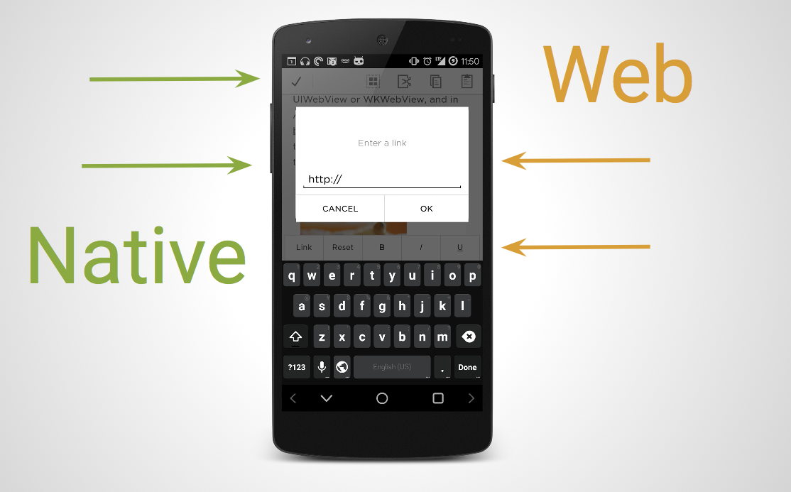
Working on the Squarespace Blog app for Android, one of the biggest challenges is that the app is half-native, half-web.
My job is to make sure you can't tell which is which.

While trying to achieve this goal, one of the first things I learned is that animations with native-level performance – i.e. animations that don't stutter, jerk, or lag – can only be achieved with hardware-accelerated CSS.
Trust me, I've tried. The other methods don't even come close.
Here's a video showing a JavaScript animation, which I rewrote using hardware-accelerated CSS transitions:
And here's a regular, non-accelerated CSS transition, which I rewrote in the same way:
Behold the power of 3D transforms! And yes, I'm not actually using the z-axis, but it doesn't matter. Just consider "3D" to be the "open sesame" to coax the GPU into revealing its treasures.
If you'd like to get started with hardware-accelerated CSS, then you can take a look at this sample widget, which is the same one from the first video. It works on all modern browsers, both desktop and mobile. (Note the hand-crafted flexbox shim and -webkit prefixes.)
These videos were taken on a rather dated Galaxy Nexus running Android 4.2, so the performance improvement is crystal-clear. But in fact, you can also see the difference on more powerful devices, and even on desktop browsers. I actually first noticed the slow trashcan animation while playing with it on desktop Chrome.
Believe me: if it's anything less than 60 frames per second, your users will notice.
- Next: Closing the UX gap
- Previous: Bootup
